This is about as good as anything else.

See you on the other side, and HEY – let’s be careful out there.
by Chris Barrus

This is about as good as anything else.
See you on the other side, and HEY – let’s be careful out there.
1996. I had just started a record label/mail order house called No-Fi and I quickly needed some stuff to fill out the catalog as I was running out of unwanted CDs in my collection to sell off. There was a guy in Philadelphia named Jason who posted to the DroneOn list. He had a 7″ single label called Doorstep Vinyl and was discontinuing it to concentrate on his band The Azusa Plane and a new label called Colorful Clouds.
I sent him $50 bucks for a few things, but in return he sent me a GIANT BOX of singles, probably everything he had. I didn’t get a chance to thank him until a year or so later at Terrastock II in San Francisco. I babbled at him about how much I liked Azusa Plane’s set (“as loud and final as an asteroid strike!” or something) but he was frustrated and kept apologizing for the rushed set because the time was changed at the last minute and really, they were rushing so they wouldn’t miss Roy Montgomery. I don’t believe he made it out to the west coast after that. I think that last time I heard from him was in 2001 when I contacted him to get hold of The Highway’s Jammed With Broken Heroes which I think was his last release.
Last year, I was driving at night through a snowstorm in Oklahoma and a track from Tycho Magnetic Anomaly… came on shuffle play. I couldn’t think of a more appropriate, compelling, and well unnerving track to listen to then. I always wondered what he was up to.
Today this message showed up on DroneOn:
Subject: [DroneOn] woah – Jason/Azusa Plane dies
Date: November 1, 2006 12:59:46 PM PST
To: droneon@lists.quartzcity.netJust heard on another list Jason DiEmilio of Azusa Plane died recently. He had some severe medical problems that, among other things, basically left him unable to listen to music so he ended his life.
In the later 90’s I listened to a lot of AP and played AP on my radio show. I was just looking at the chunk of split 7″ers in my singles boxes a few weeks ago. Didn’t he used to post here way back? Jason provided a soundtrack to many hours of my life. I hope he’s someplace where he can listen to tunes again.
How many times do people say “I wish we’d kept in touch” after tragedy? Way too goddamned much.
*sigh* R.I.P.
Matt M. pokes a stick at the movie Chinatown and uncovers the horror movie that lies within.
Not only is Cross a crook who manipulates civic policy, potentially endangering hundreds with flood; not only does he order murders as casually as you might step on an ant. He steals life from others to prolong his own. When he says that he wants The Future, he’s not just talking about the future of water in the city or his personal fortunes. He is talking capital T, capital F The Future. “How many years have I got? She’s mine, too,†he tells his daughter, Evelyn of his granddaughter Katherine.
But Katherine Mulwray isn’t just his granddaughter. She’s his daughter, too. Evelyn Cross Mulwray isn’t only Katherine’s mother, but she’s her sister. Is this adding up? Cross slept with his daughter to give birth to another daughter that is more than half of himself (assuming that you can call your child half your own). And his plan is to sire another child who is more than three quarters himself. Cross commits monstrous, perverse acts in order to extend his power and his grasp of the future. Not only will he live through his daughter, but his granddaughter and even his great granddaughter, who are more and more him with every generation.
Cross is a vampire in the literal sense of the word, but worse than that, he’s a vampire that preys upon his own children, sundering taboos and any consideration but his own survival as he does so.
And in order for evil to survive, good has to be quietly vanquished. Cross extinguishes hope with every footstep. He is impervious to the law, even when Gittes finds out the truth. What’s more, Cross acts with impunity, all but kidnapping the only innocent being in the story right under the noses of the police and a powerless Gittes. What’s more, Gittes has to take it. He has to swim in that water, and in order to do so, it’s easier to let evil triumph. The Bad Guys win, and not in a “zombies swarm all over the wreckage” kind of way. It’s a very personal, intimate kind of devastation that Cross wreaks. He is able to take the fight out of Gittes (whose been shown to be more than capable of manipulating any situation) with seemingly no effort.
Happy Halloween Los Angeles!
(Credit to Masonic Boom for finding this one first before I got to Astronomy Picture Of The Day in my feed reader.)
The album cover for Spiritualized’s Lazer Guided Melodies:

The dark nebula SH2-136:

Dear Apple Customer,
Apple is pleased to report that a shipment for the following order is on its way to you.
The following products shipped on 10/30/2006.
MBPRO 15/2.33 CTO
With the following configuration:
Processor 065-6642 2.33GHz Intel Core 2 Duo.
Memory 065-6619 2GB 667 DDR2 SDRAM-2x1GB
Hard Drive 065-6624 160GB Serial ATA Drive@5400rpm
Optical Drive 065-6625 SuperDrive 6X
Display 065-6631 15" Widescreen Display
Modem 065-6645 None
Apple Software Solutions 065-6200 None
Keyboard/Mac OS Language 065-6627 BkLit Keyboard/Mac OS
Country Kit/AEX 065-6628 Country Kit

*Loads FedEx tracking page. Obsessively hits “reload.” Repeats*
Ladies and gentlemen, the aftermath of the highest scoring game of Scrabble ever:
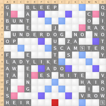
New records for most points in a game by one player (830), the most total points in a game (1,320), and the most points on a single turn (365 for “QUIXOTRY”).
Make up your own “Author X meets Cultural Critic Y” combinations here, because things are just too strange…
These “Warning Signs for Tomorrow” might be a little more urgent and key now:


I was on Charles Phoenix’s whirlwind Los Angeles tour back in March. Apparently someone videoed the event and edited the whole works into a 15 minute overview. In keeping with the Disneyland theme, I suppose you can call it “The Disneyland Tour Of Los Angeles via SuperSpeed Tunnel.”
[youtube]kIaBThV1ekc[/youtube]
It used to be that the A#1 most-cringe-inducing eyesore that confronted me on my morning commute were the Rachael Ray billboards. I still hate them and Ray, but I can’t remember the last time I saw something that induced an out-loud “EEEWWW!” reaction out of me until I saw this abomination:
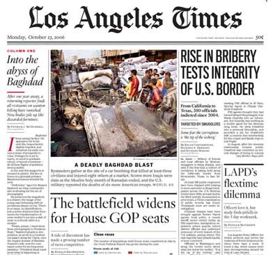
(picture cropped to roughly what the top fold looks like)
Uhhh, what the hell were they thinking? Sure, the LA Times has been having problems lately, but it’s not like their graphic design and layout staff abdicated all at once. Or did they? That ginormous serif font in column two and three screams pure “I’m typography for an Anaheim Hills McMansion community newsletter” and clobbers the poor subheading and chart below with the elegance of a drunken Hummer driver on a cell phone.
I have no idea where to start on columns four and five. Column four is a mine field with four different styles in succession. I’m guessing that the designers couldn’t come to a consensus on which style to use, and decided to just go with all of them. I still can’t avert my eyes from that sans headline though – I’m reminded of the font that the U.S. Air Force uses, plastering it on planes in a point size almost as large as the plane’s own fuselage.
Apparently the Times referred to the redesign and re-architecture of the paper’s format as “The Manhattan Project.” Not altogether unfitting for something done in secrecy with no outside input at all.
By way of contrast here’s today’s NY Times top fold:
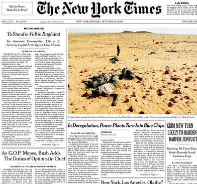
Regardless of what your opinion of the NYT is, I can’t think of a better way to draw attention, display headlines, and then get out of the way once you dig into an article.
How would I redesign the LAT? Send Edward Tufte into 202 W. 1st with a gun.
Pruned ran this picture of NYU students in 1943 learning how to design camouflage schemes and instantly decided that it had to be a desktop picture.
