
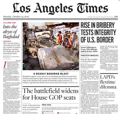
It used to be that the A#1 most-cringe-inducing eyesore that confronted me on my morning commute were the Rachael Ray billboards. I still hate them and Ray, but I can’t remember the last time I saw something that induced an out-loud “EEEWWW!” reaction out of me until I saw this abomination:
(picture cropped to roughly what the top fold looks like)
Uhhh, what the hell were they thinking? Sure, the LA Times has been having problems lately, but it’s not like their graphic design and layout staff abdicated all at once. Or did they? That ginormous serif font in column two and three screams pure “I’m typography for an Anaheim Hills McMansion community newsletter” and clobbers the poor subheading and chart below with the elegance of a drunken Hummer driver on a cell phone.
I have no idea where to start on columns four and five. Column four is a mine field with four different styles in succession. I’m guessing that the designers couldn’t come to a consensus on which style to use, and decided to just go with all of them. I still can’t avert my eyes from that sans headline though – I’m reminded of the font that the U.S. Air Force uses, plastering it on planes in a point size almost as large as the plane’s own fuselage.
Apparently the Times referred to the redesign and re-architecture of the paper’s format as “The Manhattan Project.” Not altogether unfitting for something done in secrecy with no outside input at all.
By way of contrast here’s today’s NY Times top fold:
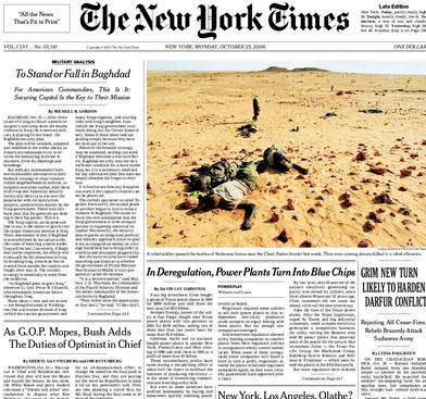
Regardless of what your opinion of the NYT is, I can’t think of a better way to draw attention, display headlines, and then get out of the way once you dig into an article.
How would I redesign the LAT? Send Edward Tufte into 202 W. 1st with a gun.
I picked up the paper this morning, and my first reaction was “what the hell have they done now, why can’t they leave my damned paper alone.”
Plus – they moved the editorial page to the back of the first section. And dedicated the whole page to “What is an Editorial – a first-grade primer”.
There’s changed that could be made that would please me. Getting rid of the financial quotes was brilliant, that dinosaur had been around about five years too long. Combining the ‘Calendar” and “View” – eh, I could give a crap. They could dump the classifieds for the same reason as the stocks; and they could leave out all the filler that I feel guilty about throwing away every morning. Lose the sports section. Provide space for an alternate caption below “Family Circus” – and perhaps show “yesterday’s best” in the same manner as the previous crossword. I actually liked the sudoku – gives me something to do when I’ve exhausted the entertainment value of the rest of the rag. Heck – I might even go along with a Denver Post/New York Post-stle single-fold layout – it’s a lot easier to read in the Metro.
But needless font manipulation? I didn’t pay 50c a day for that.
Absolutely hideous. Let’s face it, the LA Times has mostly sucked throughout most of its history. In the ’90s it was gradually improving in terms of depth and substance, but this font change simply represents the simple culmination of the paper’s onward plunge to the illiterate’s market. The innards of the paper have reflected that for some time–ever fewer serious articles on matters of national and international concern; more and more primary colors, pointless graphics and “soft” sections trying to appeal to the greater Los Angeles “community” (an oxymoron if ever there were one); a narrowing vocabulary and reference range. Perhaps the paper is struggling because so many of the people who in former times read it regularly each morning receive their news from both other sources (e.g., special-interest magazines and the National Edition of the NYT) and and media (Internet etc.). Ironic, considering that for decades the L.A. Times was derided nationally as an ultraconservative backwater rag.