
 I have zero opinion on Courtney Cox and the show Dirt, but if FX promotion is going to plaster that poster all over my city then I’m going to pound on this.
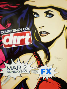
Please, please, please come up with a better logo that doesn’t use that idiotic upside-down letter “i.” Yes I know the “i” is doing double-duty as an exclamation point, but it looks awkward – even more when it’s inside that box offset. A simple “dirt!” would fit in well with the poster’s Nagel-Lichtenstein pop art riff. Honesly I kinda like the art. It’s certainly a vast improvement on the hideous goth metal album cover poster for the show’s first season, but that logo is design kryptonite.
Attention FX: next time go directly to the Pander Brothers for this sort of thing. k thx bye.