
Something had been bothering me about the last four James Bond films and my irritation had nothing to do with Pierce Brosnan (who was a perfectly capable Bond, even when elements of the movies, well, weren’t). I was put-off by the mix-up of Serpentine italic and Britannic bold italic with the traditional sans serif caps used in the opening titles. To illustrate:

Ugly. Not just ugly, but tremendously ugly. At best, they’re suitable for a video game box but fundamentally they’re about as striking and iconic as a direct-to-DVD E-list action movie. Worse, they clash with the font used for the rest of the credits. Now compare these with some earlier ones from the Maurice Binder era:
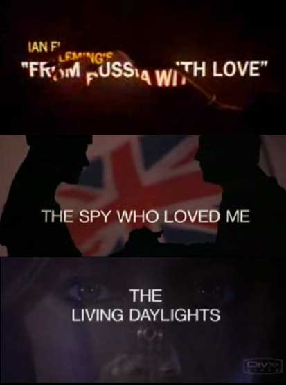
Consistent and elegant typography. As outrageous as a typical Bond movie is supposed to be, you at least feel like you’re about to see something better than your average spy/action/comic book flick. Which brings us to Casino Royale:
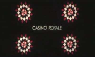
That crap ItalicBoldMetallic title font is finally tossed for a sans serif (I think it’s Century Gothic) that’s familiar enough, but honestly I didn’t notice that much because the opening credit sequence is so bloody great. Congrats to Daniel Kleinman for making us forget how lousy Chris Cornell is. Note to Barbara Broccoli and Michael Wilson, please hire Hooverphonic or Alison Goldfrapp for the next movie. k thx bye.
As for the movie itself. Casino Royale and Daniel Craig wisely sidesteps the entire “how does he compare to Connery” issue that a zillion armchair critics have saved into their blog draft folders and goes completely off-axis to a third Bond-archetype that isn’t Connery or Moore. Something about Craig’s Bond was naggingly familiar when about two-thirds of the way through, I figured it out. These are the two actors people should be comparing together:
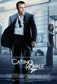
All the online reviews are pretty spot-on, so I won’t waste your time with running through them again. The best thing I can say about it is that after it finished, I immediately wanted to see the sequel. It’s also the only movie this year I’ve paid to see twice.
You can watch the opening credits to all of the Bond movies here. Typotheque has a lengthy essay on the title design to From Russia With Love and Salon looks at Maurice Binder’s work.
Do you know the exact font used for The Spy Who Loved Me titles above? I think it was used in the closing credits for Die Another Day as well, but can’t be sure.
cheers!
john
John –
I’m pretty sure that the font for The Spy Who Loved Me is a basic Helvetica standard.
Do you know the exact font used for 007 and Casino Royale?
Cheers!!!
Like I said in the post I *think* it’s Century Gothic but it might have been altered somewhat.
Eurostyle? Eras?
I checked and it *is* Century Gothic