
 My copy of Cover Story: The Art of American Magazine Covers 1900-1950 arrived this morning and the outside world disappeared for a bit while I flipped through it. I was tipped off to the book by a feature over on PopCult’s site which details the decline and eventual fall of western magazine design. An excerpt (but you should really go to their site and see the cover design face off)
Take a look at your local newsstand and here’s what you’ll see: racks upon racks of magazines that look almost identical. Whether they focus on music, fashion, cigars, fitness, women, or men, most magazines typically feature a grinning celebrity on the cover peeking out from behind squadrons of coverlines. It wasn’t always like this.
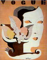
From the “golden age” of magazine popularity in the 1920s-’30s and on through to the early ’60s, even the most mainstream of magazines tried to lure in readers with distinctive design, original typography, and striking artwork. The cover was considered a canvas–rather than merely a billboard–by groundbreaking art directors like Mehemed Fehmy Agha (Vogue, House & Garden, Vanity Fair), Alexey Brodovitch (Harper’s Bazaar), and Eleanor Treacy and Francis Brennan (Fortune). These and other designers of that era transformed magazines into works of art in themselves. As Owen Edwards writes in The American Magazine, these designers and their magazines of the ’30s “exerted a visual influence on Americans no less potent and persuasive than that of Hollywood.” They commissioned covers by the finest artists, illustrators, and photographers of the day, such as Diego Rivera, Antonio Petruccelli, and Margaret Bourke-White (among many, many others). The design principle of that era seems simple enough: create the most ravishing covers possible. That was the way to distinguish your magazine from its competitors.
Today, the art of the magazine cover has been vanquished by celebrity worship and bad taste. Designers are simply fulfilling the dictates of their industry, not unlike the paint person on an auto assembly line. Innovation, creative expression, or even cleverness has been mostly abandoned. Artistic considerations are limited to how much retouching the celebrity headshot requires in Photoshop and how many headlines can be crammed in before the cover looks too “busy.” The result: A world in which it’s difficult to tell the difference between Playboy and Harper’s Bazaar without cracking them open.
What I find amazing is the quality of design standards across all of titles – not just the iconic Life photo covers, Norman Rockwell’s Saturday Evening Post, the New Yorker cartoons, and countless crime and science fiction pulps that most folks think of. A forgotten theater art magazine called Shadowland had a beautiful neo-cubist deco cover every month. Cover Story is a good start, but damnit, I want more now!